Aero Coffee Roasters
Deliverables: Logos, Style Guide, Typography, Palette, Patterns, Business Cards, Menu, Direct Mail Postcard, Vehicle Wrap, Signage, Packaging (bags, boxes, sleeves, labels, etc.)
The Objective: Rework the existing Aero logo to better represent the quality of the coffee collection and the welcoming vibe of the Aero cafe located in Northborough, MA.
Description: Peter wanted to blend his two passions—coffee and cycling—into Aero's visual identity. We collaborated to create a unique logo featuring a bike gear with a coffee bean at its center. The branding was rounded out with a playful, all-lowercase font and a bright, welcoming palette of blue and vibrant accent colors. A simple style guide was created to help the Aero team maintain consistency across future print and digital materials.
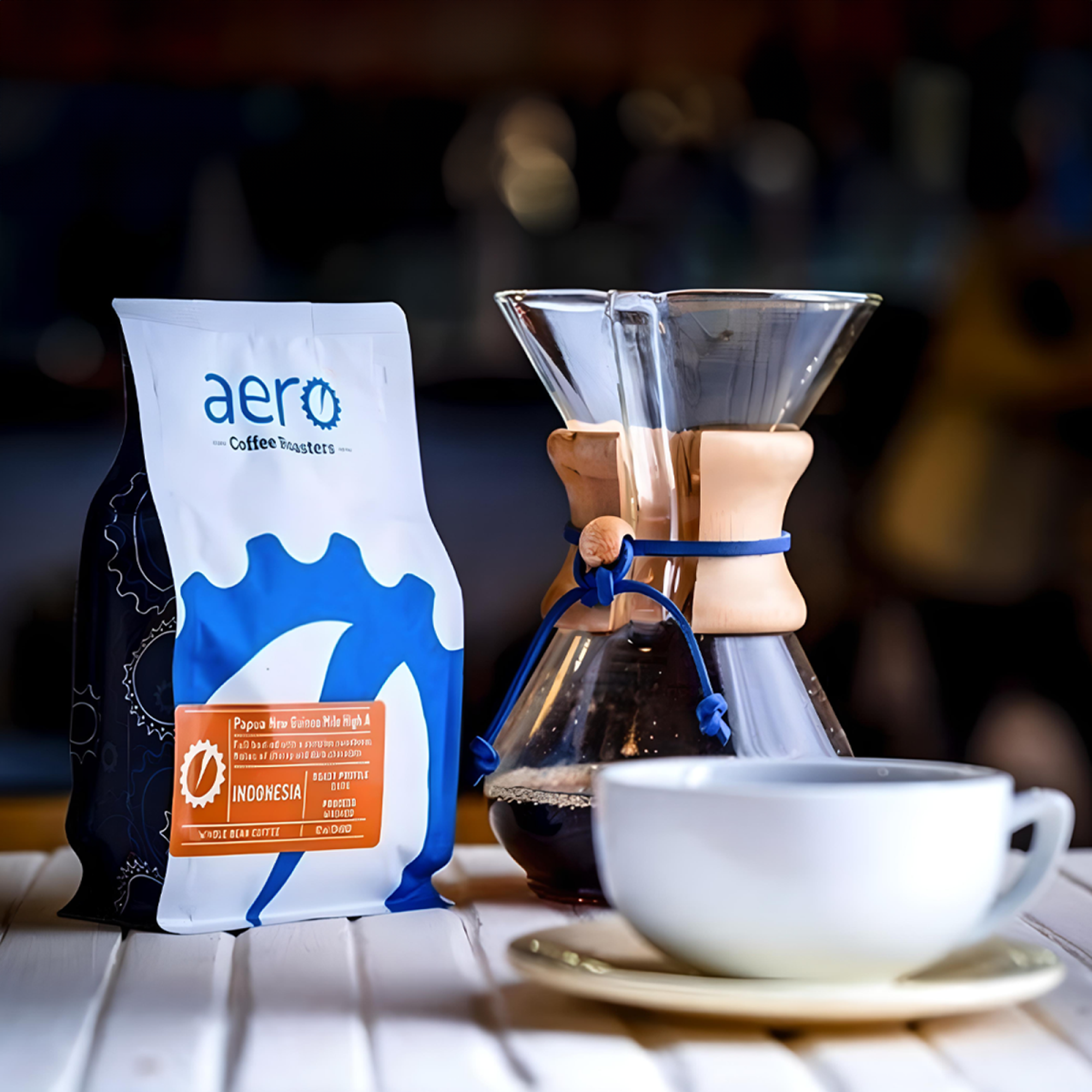
For the packaging, we designed a flexible and budget-friendly system: a single bag design paired with colorful labels for Aero’s various roasts. Additional branded assets included storefront signage, a van wrap, packaging for steeped coffee bags and pastries, plus print materials like a direct mail postcard, stationery set, and menu.


