F–IT
Deliverables: Naming, Logos, Typography, Palette, Animation, Patterns, Social Templates
Objective: Concept and develop an identity for the sister company F-IT by Any Means Necessary, offering a fitness-focused product line. The new logo should establish a strong brand presence, fostering recognition and differentiation in the market while maintaining consistency with the overarching brand identity of Any Means Necessary.
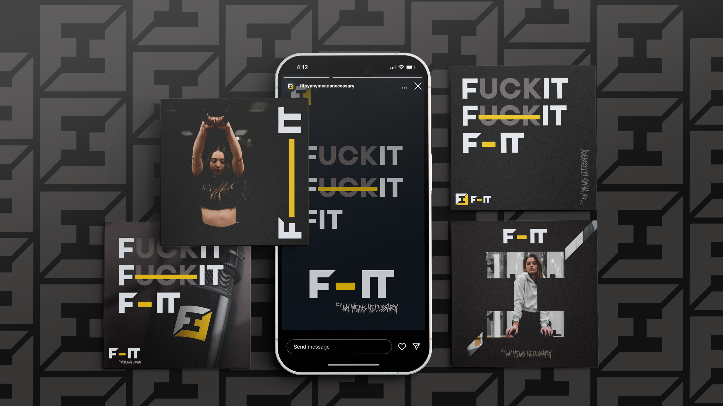
Description: Mikey Nemitz and Shawn Coss of Any Means Necessary reached out early in 2024 about launching a no-apologies fitness brand for the gym-obsessed individuals of the world. We were more than happy to accommodate! The two AMN founders were interested in exploring a bold mark that played with the positive/negative space, and that would be flexible across print and digital collateral.
Naming - During the discovery and research phase, and reviewing brand strategy, we casually tossed out the idea of playing with FIT and F*ck It… something along the lines of F/IT by AMN. The guys liked the name and it stuck!
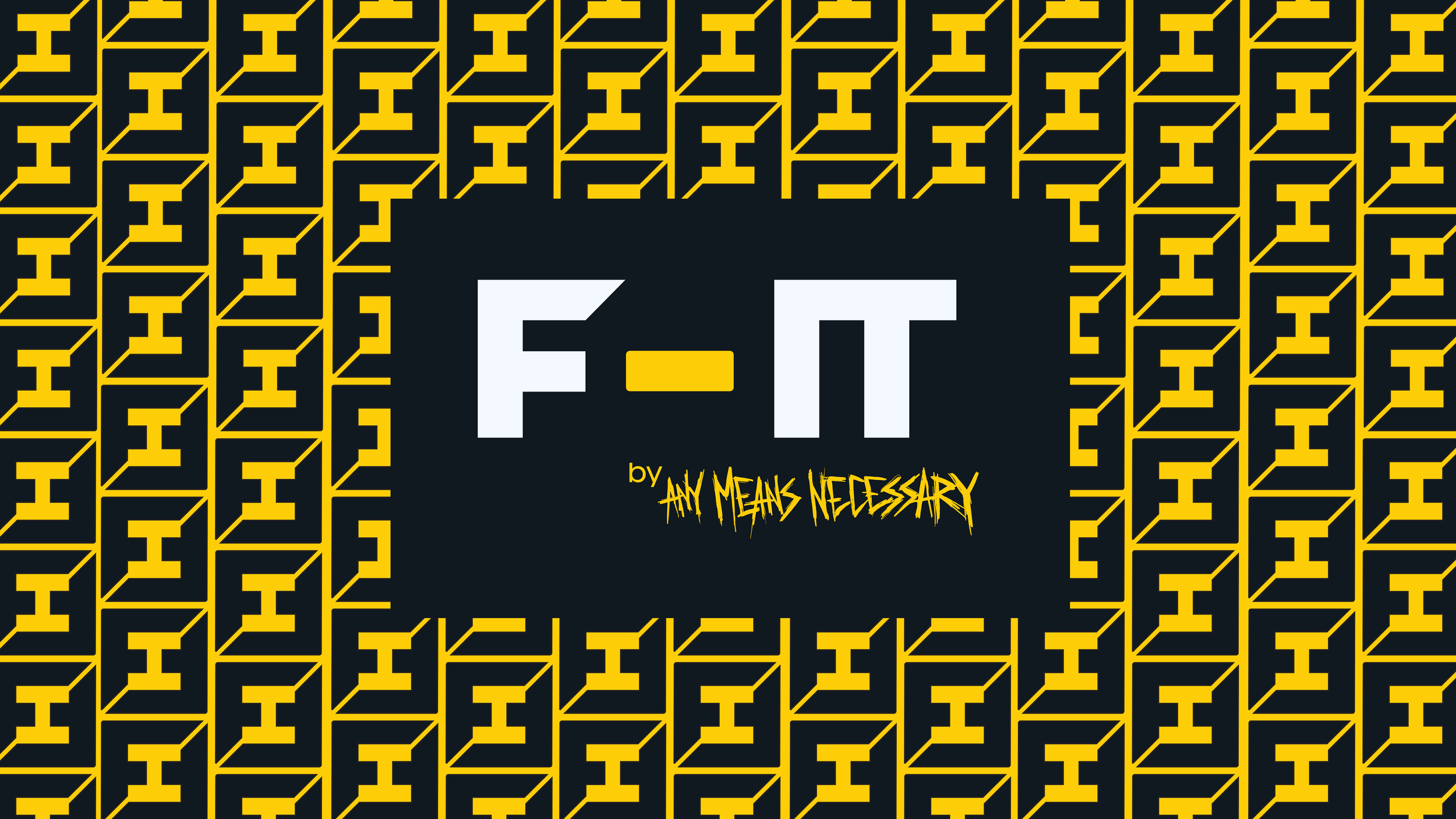
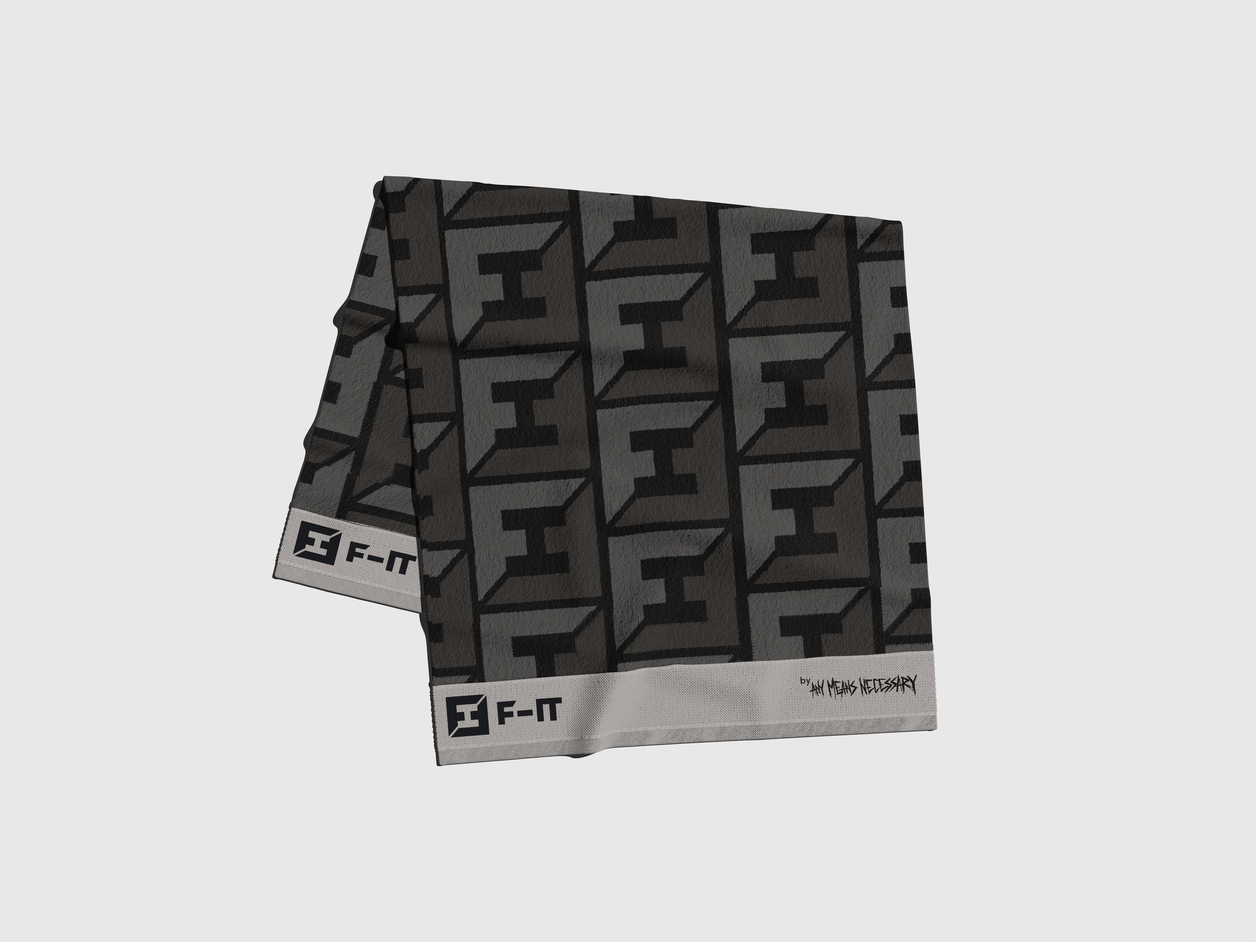
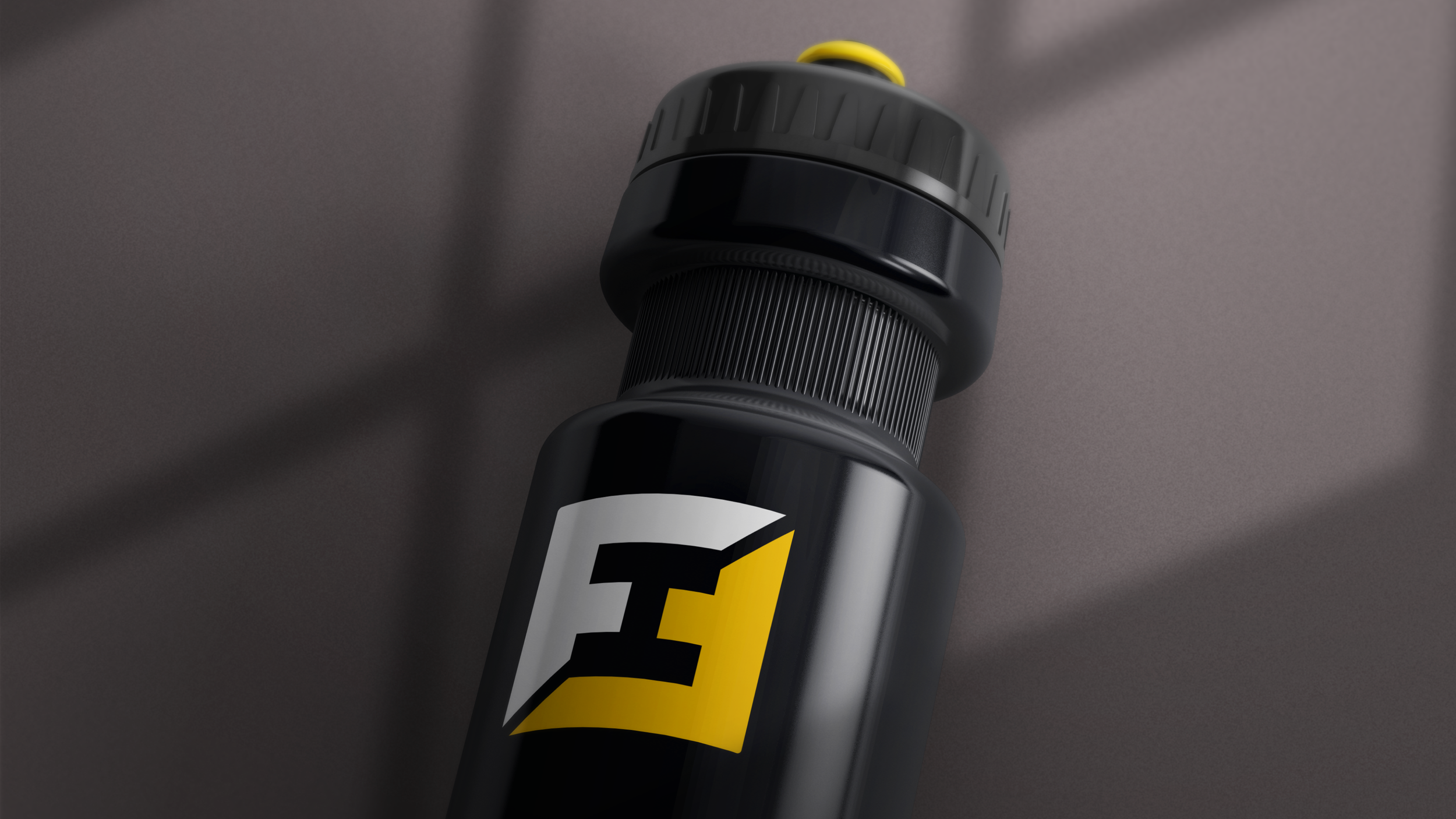
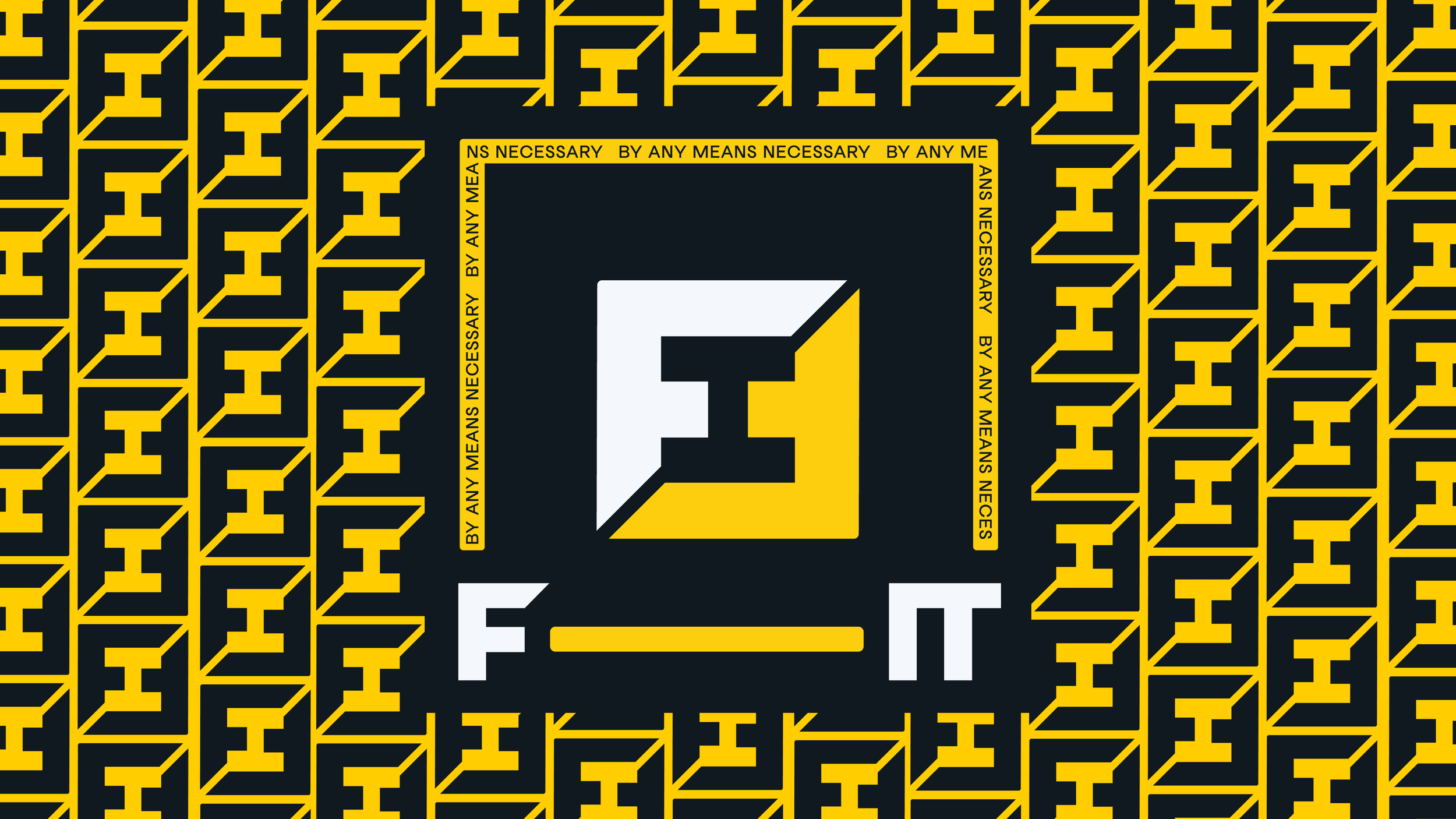
The logomark - We noticed when you use an uppercase ‘F’ and then rotate a second one 90 degrees, the negative space resembles a dumbbell. This mark is flexible and can be used as a repeating pattern placed on packaging, as a mask over product photography or simply on it’s own.
The wordmark - the dash between ‘F’ and ‘IT’ has a flexible width and can expand/contract depending on the deliverable. This reflects the adaptability of the F-IT target audience.

