Food&
Beverage
Our experience in the food and beverage sector spans a variety of exciting projects—from designing the visual identity and packaging for an artisanal coffee roaster to crafting the name, identity, and packaging for a boutique tequila brand.
We offer a full suite of services, including product naming, logo and identity design, packaging, social content, design templates for your in-house marketing team, copywriting, and promotional merchandise. Whether you’re launching a brand-new venture or looking to refresh an existing one, we’re here to support you at every stage of your food and beverage journey. Let’s create something memorable together!
Recent Projects
CLIENT
Aero Coffee Roasters
DELIVERABLES
LOGOS
STYLE GUIDE
TYPOGRAPHY
PALETTE
PATTERNS
BUSINESS CARDS
MENU
DIRECT MAIL POSTCARD
VEHICLE WRAP
SIGNAGE
PACKAGING (bags, boxes, sleeves, labels, etc.)
This branding and identity design project kicked off when Peter Fermino, the owner of Aero Coffee Roasters, reached out about refreshing a logo concept he had started…
The Objective: Rework the existing Aero logo to better represent the quality of the coffee collection and the welcoming vibe of the Aero cafe located in Northborough, MA.
Description: Peter wanted to blend his two passions—coffee and cycling—into Aero's visual identity. We collaborated to create a unique logo featuring a bike gear with a coffee bean at its center. The branding was rounded out with a playful, all-lowercase font and a bright, welcoming palette of blue and vibrant accent colors. A simple style guide was created to help the Aero team maintain consistency across future print and digital materials.
For the packaging, we designed a flexible and budget-friendly system: a single bag design paired with colorful labels for Aero’s various roasts. Additional branded assets included storefront signage, a van wrap, packaging for steeped coffee bags and pastries, plus print materials like a direct mail postcard, stationery set, and menu.
Website: aerocoffeeroasters.com
All photography by Bearwalk Cinema
CLIENT
Flor de Fuego Tequila
DELIVERABLES
NAMING
LOGO
STYLE GUIDE
TYPOGRAPHY
PALETTE
PACKAGING
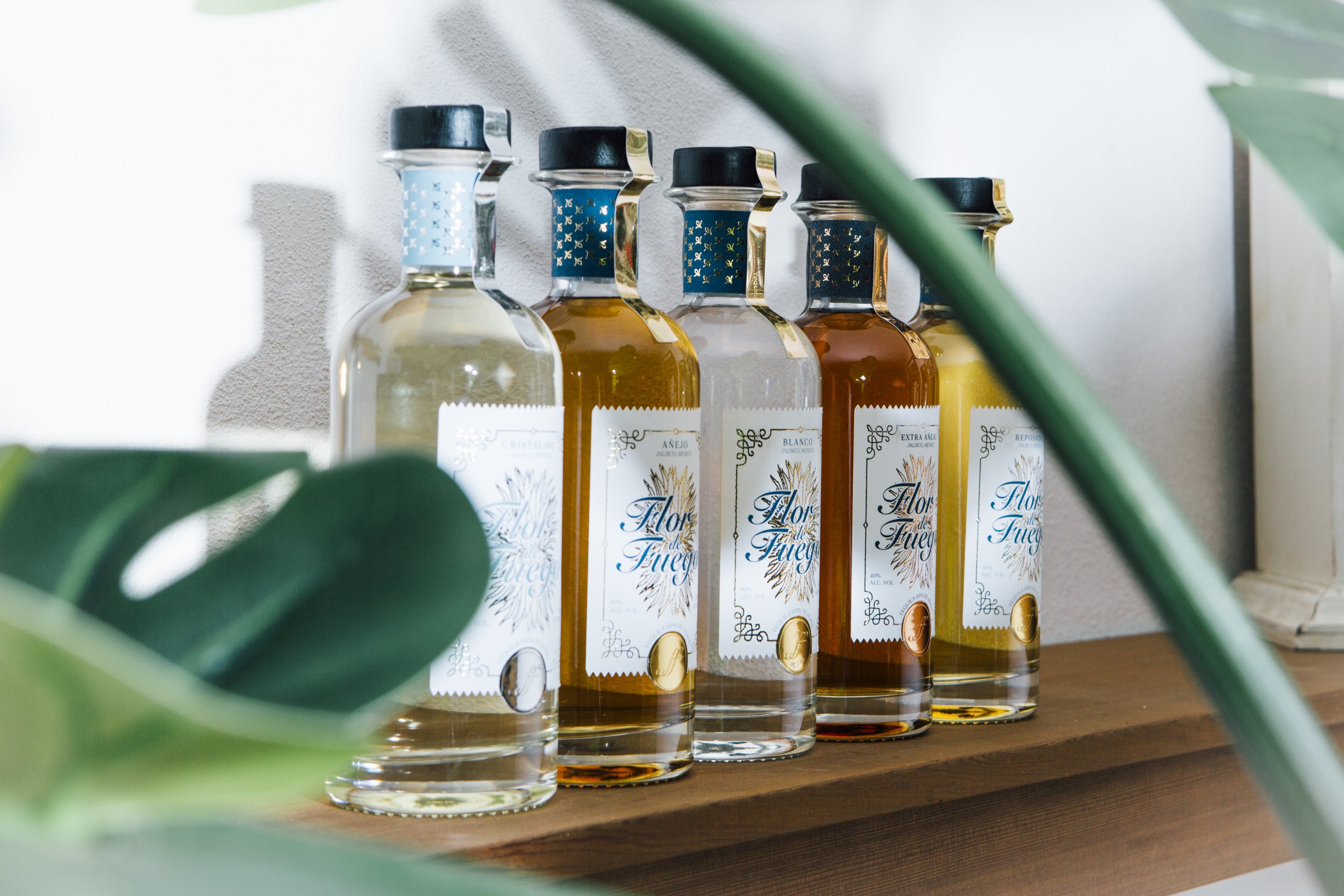
Objective: Develop a striking visual brand identity and packaging for a new line of top-shelf tequilas.
Description: We had the unique opportunity to name a tequila brand—a project we truly enjoyed! Working closely with the founder, we consulted on everything from bottle and cork selections to creating logos for all five tequila varieties, along with typography, color palette, and label designs. As a fun bonus, we got to taste test and compare some of the finest tequilas!
A note about the process:
Naming: During our research into tequila production, we learned that agave plants thrive in volcanic ash. The image of a flower growing from fire, combined with the sharp, vertical lines of the agave plant, inspired the name Flor de Fuego.
Design: We typically start with typography, followed by image research for the logo, icons, and photography. Colors and patterns come next, and before we know it, we’ve developed 3–5 design directions to share with the client.
CLIENT
Cabichoo Coffee
DELIVERABLES
LOGOS
STYLE GUIDE
TYPOGRAPHY
PALETTE
PATTERNS
PACKAGING
Objective: Develop a unique identity and eco-friendly package design for a new coffee roast named “Cabichoo”. The name has the most adorable backstory–more on that later.
Description: We collaborated with Fresscafes’ founder Pablah, and her associate, Julia, to create a unique visual identity and packaging for their new coffee line, Cabichoo. This included designing a new logo and establishing brand assets such as a color palette, typography pairings, icons, and patterns. A style guide was also developed to ensure consistent use of these elements across all applications, including custom coffee packaging that lets customers bring Fresscafe home.


