Service
Our expertise in the service sector is pretty diverse. We’ve developed just about everything from the website to custom wraps for an entire fleet of moving vehicles. We refreshed and expanded the visual identity for a title company, and branded a non-profit dedicated to community development.
Whether you’re launching a new service-based business or revitalizing an established one, we’re committed to supporting you at every step along the way, helping you connect with your audience and stand out in a competitive market.
Recent Service Projects
CLIENT
RARE Moving & Storage
DELIVERABLES
LOGOS
STYLE GUIDE
TYPOGRAPHY
PALETTE
PHOTOGRAPHY & IMAGE SOURCING
PATTERNS
SOCIAL TEMPLATES
SOCIAL PROFILE GRAPHICS
PRINT & DIGITAL ADS
CREATIVE DIRECTION
VEHICLE WRAPS
STOREFRONT SIGNAGE
WEBSITE DESIGN
DIRECT MAIL POSTCARDS
BROCHURE & CATALOG
TRADE SHOW BRANDED COLLATERAL
Objective: Lead the development of a strong, cohesive identity for a premier Boston-based moving and storage company with a reputation for exceptional service and community impact. The visual identity should reflect the company's hardworking, athletic, and thoughtful crew, while appealing to residents in Boston’s finest neighborhoods. The design will communicate trust, reliability, and a commitment to excellence, supporting the company's brand as a top-tier service provider and a community-focused organization.
“Hink was the best marketing move that I made upon starting RARE Moving & Trucking Company, Inc. Niki’s constant help with design and her positive energy has helped to propel RARE on our national campaign.”
Description: We’ve worked with RARE from the very beginning – for them and for us. When the owner first approached us for a logo design for his new moving and trucking company, it was clear he had a vision. The way he spoke about the name, the team he’d build, and the communities they’d serve made it an honor to be part of his journey. Over the last 15 years, we’ve led RARE’s creative direction across multiple sub-brands, developing everything from print materials and web design to social assets, custom packaging, storefront signage, and vehicle wraps. Back in 2010, fresh out of school, this was our first project to come to life off the screen. Suddenly, our little logo was on moving trucks, crew apparel, and a warehouse full of branded boxes. Every new project with RARE continues to be a treat!
CLIENT
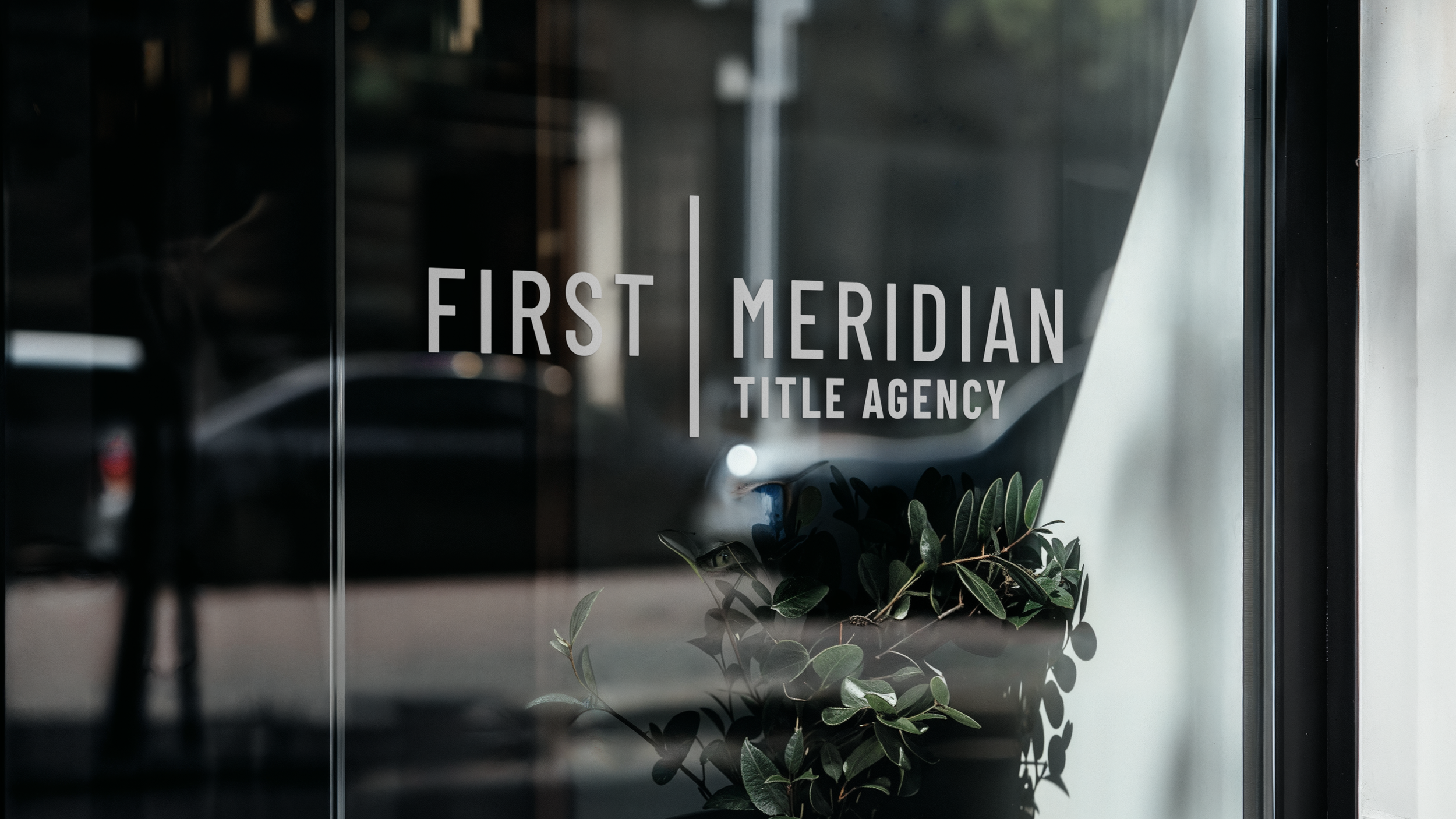
First Meridian Title Agency
DELIVERABLES
LOGOS
TYPOGRAPHY
PALETTE
STYLE GUIDE
PRINT & DIGITAL ADS
WEBSITE
STATIONERY
Objective: Develop a comprehensive and cohesive visual identity for a local title business specializing in residential and commercial title work. This refreshed identity needs to emphasize personal service, flexibility, communication, and quick problem-solving. The goal is to create a professional yet approachable brand that positions the company as a trusted partner in the title industry, while ensuring brand consistency across all platforms.
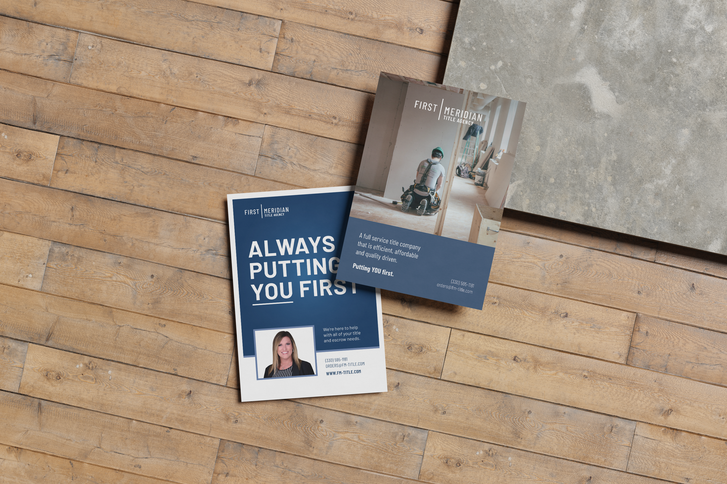
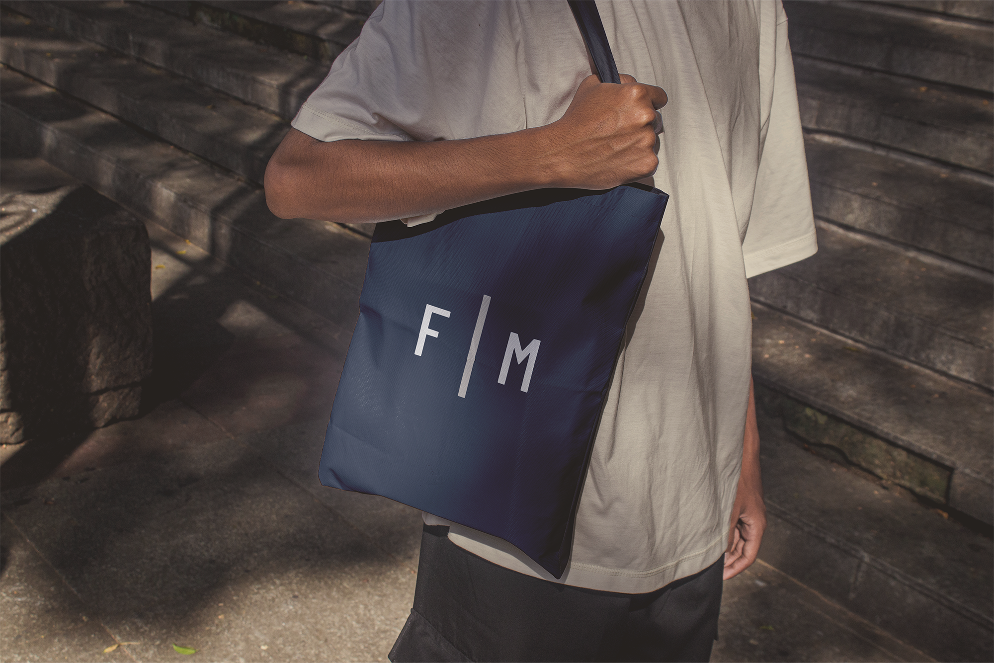
Description: First Meridian Title Agency is a women-owned business. They are absolutely incredible at taking what can be an overwhelming process and making it feel manageable for their customers. In addition to designing the FM Title logos, we developed a color palette, typography, website, stationery, social assets, print and digital ads, flyers, and trade show banners.
“Collaborating with Hink is truly a dream for any small business owner. They simplify the design and creative process, transforming our vague ideas into stunning visual options. Niki’s innovative vision shines through in her work, and you can tell that she takes the time to thoroughly understand our business and its goals. Hink has not only elevated our company logo but also equipped us with valuable insights for use when ordering items like business cards, promotional swag, and apparel, ensuring our brand image remains cohesive. Their dedication and expertise have made a remarkable difference for us!”
CLIENT
Spaces for Change
DELIVERABLES
LOGOS
STYLE GUIDE
TYPOGRAPHY
PALETTE
PATTERNS
STATIONERY
Objective: We were tasked with designing an approachable, uplifting visual identity that captured the spirit of collaboration, positive change, and shared purpose. The logo, color palette, typography, and style guide will reflect the nonprofit's mission to bring diverse communities together through beautiful and functional shared spaces. The identity should resonate with community organizers, volunteers, and stakeholders, fostering a sense of belonging and empowerment across all branding materials.
Description: The initial sketch for this logo was focused on individual elements coming together in a single mark. The shapes combined to form a quilt-like pattern that aligned with the warm and inviting mission to foster collaboration, positive change and shared purpose. The bold, playful colors are attention grabbing, and work great on both screen and print collateral.


